
Project Background
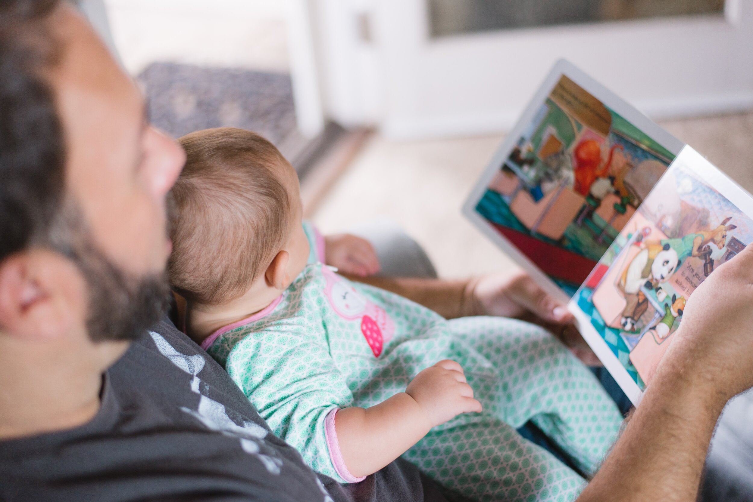
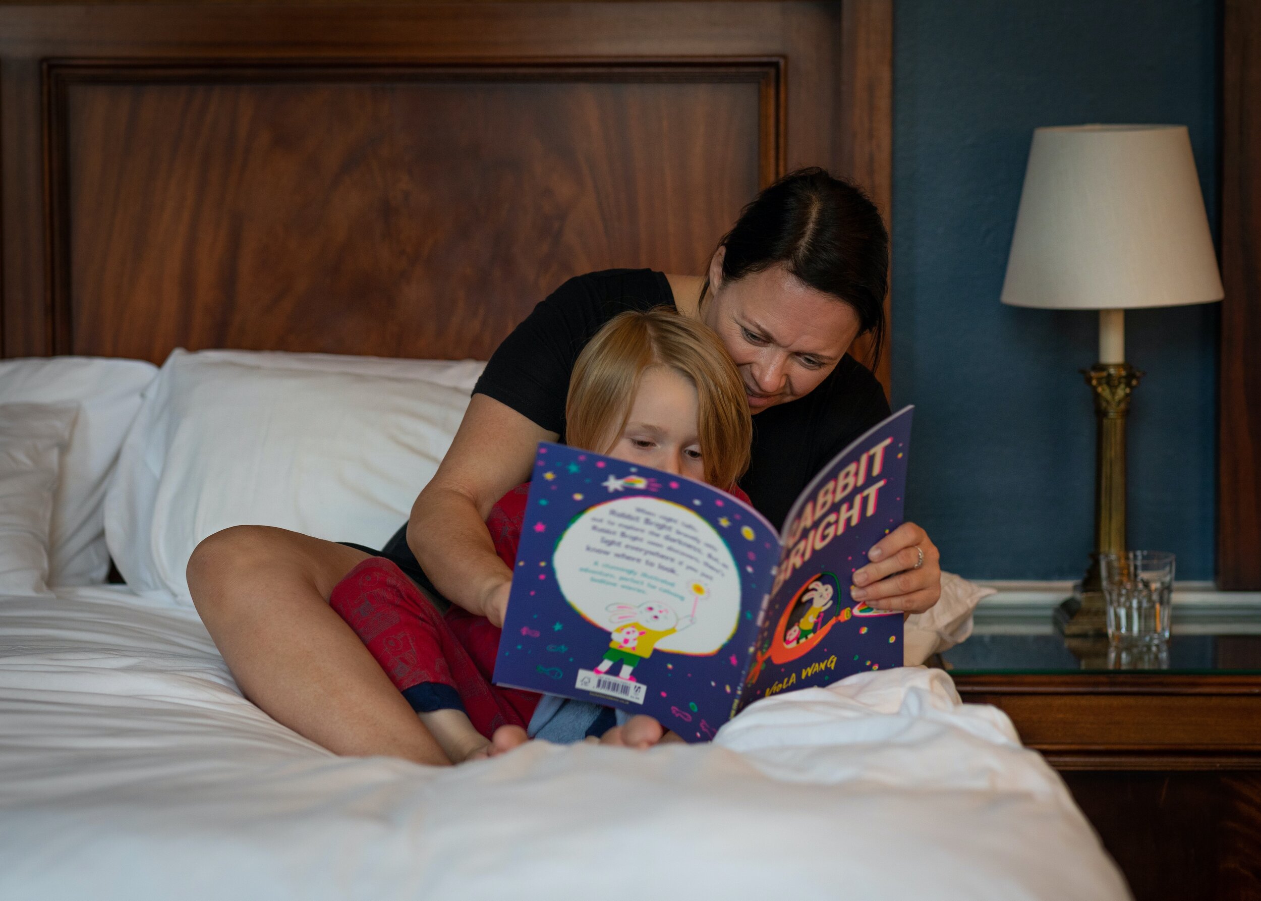
Ending the night with a bedtime story can be a sacred moment for many families. It’s a wonderful bonding time where families can have a chance to experience and learn something together. LittleTales is a tablet reading app; it contains a library for parents to choose and read books to their little ones.
During this 5-day sprint, I was tasked to design a minimum viable product (MVP) that helps parents search for the right children’s book more easily.
Role:
UX Designer, UI Designer
Tools:
Figma
Deliverables:
Sketches, Wireframes, High-fidelity prototype, User testing report
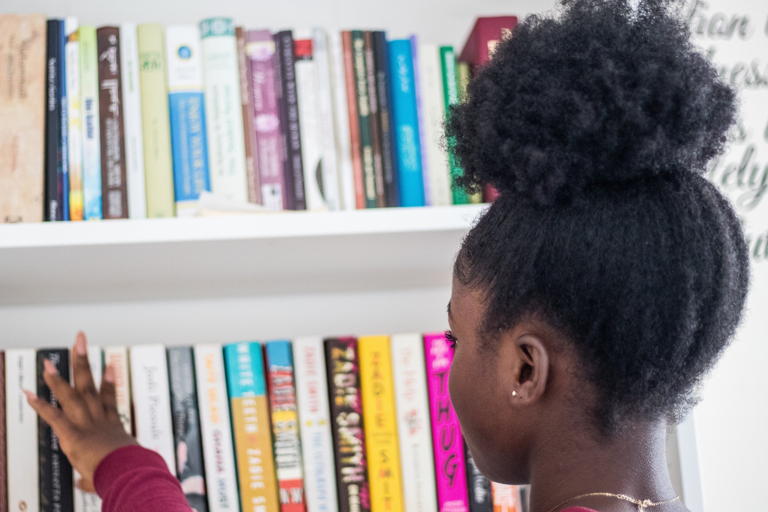
Parents are spending too much time picking out and choosing the right book for their children.
It is becoming increasingly difficult and time consuming to find the right book to read. With a growing library, parents spend precious time skimming the books their child chooses to make sure it’s appropriate for their age level and interests.
Design Sprint Week
Day 1: Understanding the User
How can parents get the information they need to help them quickly and accurately choose the right book?
Designing a product end-to-end in a week is challenging when there are so many directions to go. I wasn’t a parent; I had many cute nieces and nephews, but I didn’t fully understand the pains myself. I had so many questions: How do I start? What should I prioritize? Most importantly, what do the users want?
On day 1 of the sprint, our research team set out to interview how parents seek out books to read to their children. Their replies vary from “I like to find a story relevant to new experiences in my son’s life” to “I’m always scanning online reviews” to “I try to make sure there’s a little education.”
User Interview
LittleTales’ research team scheduled a user interview with Samantha, a mother of 3, to empathize with her recent experience finding a book to read to her children.
Motivations to read: confidence for kids, doing well in school, gets kids excited about learning, and gaining feelings of accomplishment.
Choosing a new story: Samantha is reliant on her older child’s library to recommend books. She’s looking for something fun and engaging to spend quality time together before going to bed.
Affinity Mapping
After picking out the keywords from all interview responses and writing them on sticky notes, I noticed four clear categories of user needs: childrens’ interests, finding new books, deciding on a book, and filtering book attributes.

User Persona - Claire

Claire, a 34-year-old mother of 2, reads to her children several times a week and highly values this family time together. She tries to find stories her children will love, so they’ll appreciate reading from an early age.
What are Claire’s pain points?
She often spends more time looking for stories rather than reading them.
Book-length and age level information is not readily available, so Claire has to scan the book.
Learning points and educational values are difficult to decipher in a story without first reading parts of the book.
What are her goals?
Spend less time searching and more time reading!
Find stories both children can understand and enjoy.
Find entertaining books for her children that still have educational value.
Search for topics her children are interested in or learned about in school.
User Journey
By the end of Day 1, I used our persona and interviews to understand what a typical user’s process is to find and read a book to their child. I mapped out a user journey to get a better sense of LittleTales’ MVP.
Compared to the current user journey, I added in filters when I concluded most parents were spending too much time skimming through the book for information that could be readily displayed by adding the most requested filters: age, reading level, book-length.

Day 2: Lightning Demo & Sketches
Lightning Demos
Identifying competitors in the same space helped me find opportunities while designing for LittleTales; what features were missing that users wanted? I downloaded and used three different packing apps from the App Store: Tales2Go, LittleStories, and Amazon Kindle.
Crazy 8’s (Book Preview Screen)
By the end of my Crazy 8 session, I couldn’t decide on a single screen I liked most, so I ended up picking several elements that were my favorite and Frankenstein’ed my final sketch design. Some of the elements I knew I needed for my main page based on user pain points were: age & grade level, duration of the book, book topic, as well as the thumbnail book cover and summary.
The goal of this page was to give parents all the information they normally would seek when skimming through a book, saving them time from searching and spending more time reading.

Day 3: Creating a Storyboard
Process
While designing my storyboard, I wanted to give parents the quickest way to narrow down results, and possibly an option to save filters
Based on user interviews and highlights, searching for a specific topic was time consuming; to address this, I wanted the search bar to be very noticeable.
User feedback led to the creation of filters since parents spent so much time skimming the book, checking for reading comprehension, book-length for current needs, and reviews from real parents who have children around the same age.
Long story short, parents needed a way to get the information they needed upfront without putting in the extra work and time manually finding it themselves.
Day 4: Building a Prototype
Style Guide

Prototype
My prototype was modeled after my user journey. Most children’s books followed the landscape format, so I designed the initial screens in landscape as well.
Goals for testing:
Users are able to successfully complete at least ⅔ tasks without trouble
Understand if users are getting enough information or are they receiving too much information from the UI
Learn any points of friction within the user journey


Day 5: Usability Testing & Iterating
Usability Testing
All 5 usability tests took place over a 30 minute Zoom call. My participants were parents who had children ranging in ages from 3-9. After giving a short introduction of the product, I asked users about their process of getting recommendations for a new book and deciding on a book. Afterwards, the participants shared their screens and walked through the prototype doing the scenarios I provided as I measured their task success rates.
Any remaining time was spent asking participants about the UI and general experience using the prototype. I noted their suggestions, comments, and critiques.
Task completion rate was 66%. When it came to the final task, to “find the shortest book available in the list,” most users automatically went to the left filter menu button instead of the ‘Sort by’ option I intended for them to use. While their intentions were correct, I had not anticipated users to automatically go back to the filter menu. In hindsight, I don’t believe this is a usability flaw, as the user is still using the filter menu as intended.
Landing Page
One user mentioned that while it was helpful to have the star rating shown automatically, it would be even quicker for her to get information about recommended age and grade levels upfront. This way she wouldn’t have to click into the filters to find what she needs.
Iteration: I changed the wording of the ‘Settings’ page to ‘Profile’ due to users questioning the purpose of the original tab.
The ‘Profile’ page was added after a user suggested the feature to add ‘friends’ where users can keep track of what their friends were reading.
Before

After

Sorting Books
The sort by feature was considered as helpful aside from one significant detail: it’s too general. When users correctly selected “length” to fulfill the task of finding the shortest book, they had no way of knowing which book was the shortest.
Iteration: I added “Low to High” and “High to Low” as well as “Highest Ratings” to give more context in the sorting button.
Before

After

Book Preview Page
“What if I only want to read Chinese books to my kid?” One aspect I hadn’t considered was the addition of using “language” as a filter. ⅗ of the parents I spoke to were bilingual.
“I like to read the worst reviews first,” 2 users exclaimed.
Iteration: I added a ‘Language’ section in the Book Preview page and a filter in the menu.
Separating the stars was another way of filtering information for the user so they wouldn’t need to sift through it manually.
Before

After

Reading Page
Several users during testing mentioned their children preferred physical books as opposed to digital books. When asked why, answers ranged from: “he can’t tell how much he’s read so far” (in digital format), “the font is sometimes too small to read,” and “they like to flip through the pages.”
The first design used the original page from The Rainbow Fish book. Unfortunately, once it’s read on a tablet, the original font is much too small.
Iteration: Trying to replace the tactile nature of a physical book was tricky, but I decided to add a progress bar at the bottom to give children a visual cue of how far they read.
To address the small font, I created my own text box and added a settings icon to allow users to change the page’s font size or icon colors.
2 users brought up the idea of bookmarking a page if they couldn’t finish a book so I added a bookmark option.
Before

After

Reflection
In this 5 day sprint, I achieved more than I expected I could. This challenge really forced me to be mindful of my time and focus only on the absolute necessities of the product. After some reflection and speaking with a couple of mentors, a few key points helped guide me in completing my sprint.
Design for users, not originality
With only one day allowed for lightning demos and sketching, I relied heavily on my notes about competitors. What did they have that users were asking for? What were they lacking? Is the format easy to use?
One mentor reminded me that I’m not designing to be original, and I should only be thinking of users. I counted this as a success when a user mentioned how the app was so recognizable (thanks for the inspiration, Forever21.com).
Design with a purpose
When asked what the ‘Settings’ icon did, I was caught off guard. I thought “every app has a settings page, I’ll decide what to do with it later.” No. If the user or I couldn’t fathom what would occur if I clicked into the Setting tab, it was a red flag.
I learned that while it isn’t a bad thing to take inspiration from other apps, I should only be adding in features that would be relevant for my app. Everything else is unnecessary noise.
I actually ended up changing ‘Settings’ to ‘Profiles’ after a suggestion from a couple users exclaiming how fun it would be to be able to add friends and see what books they were currently reading.